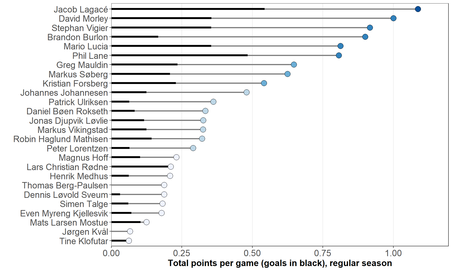
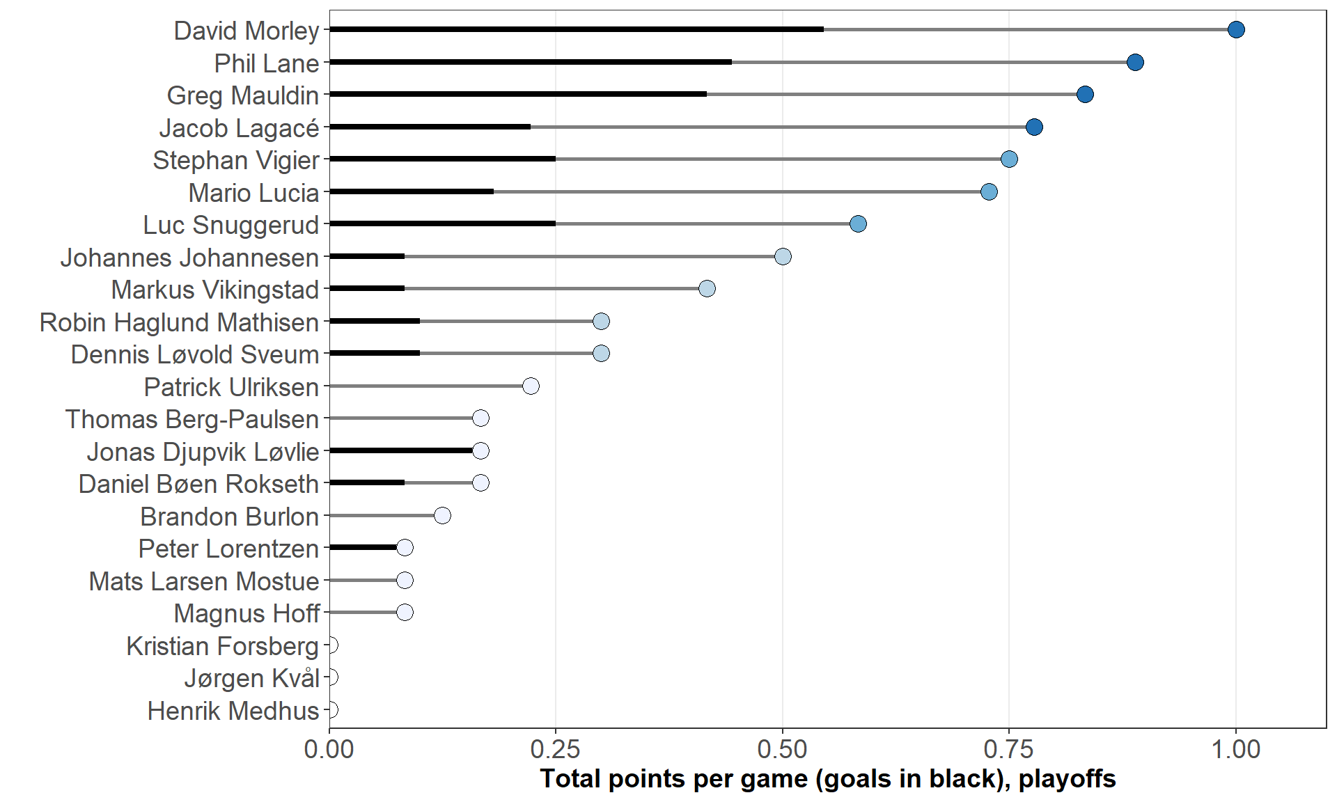
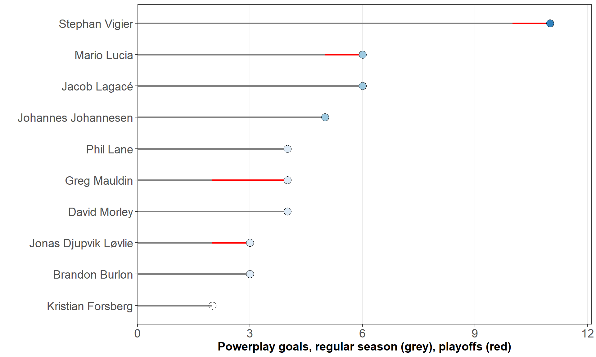
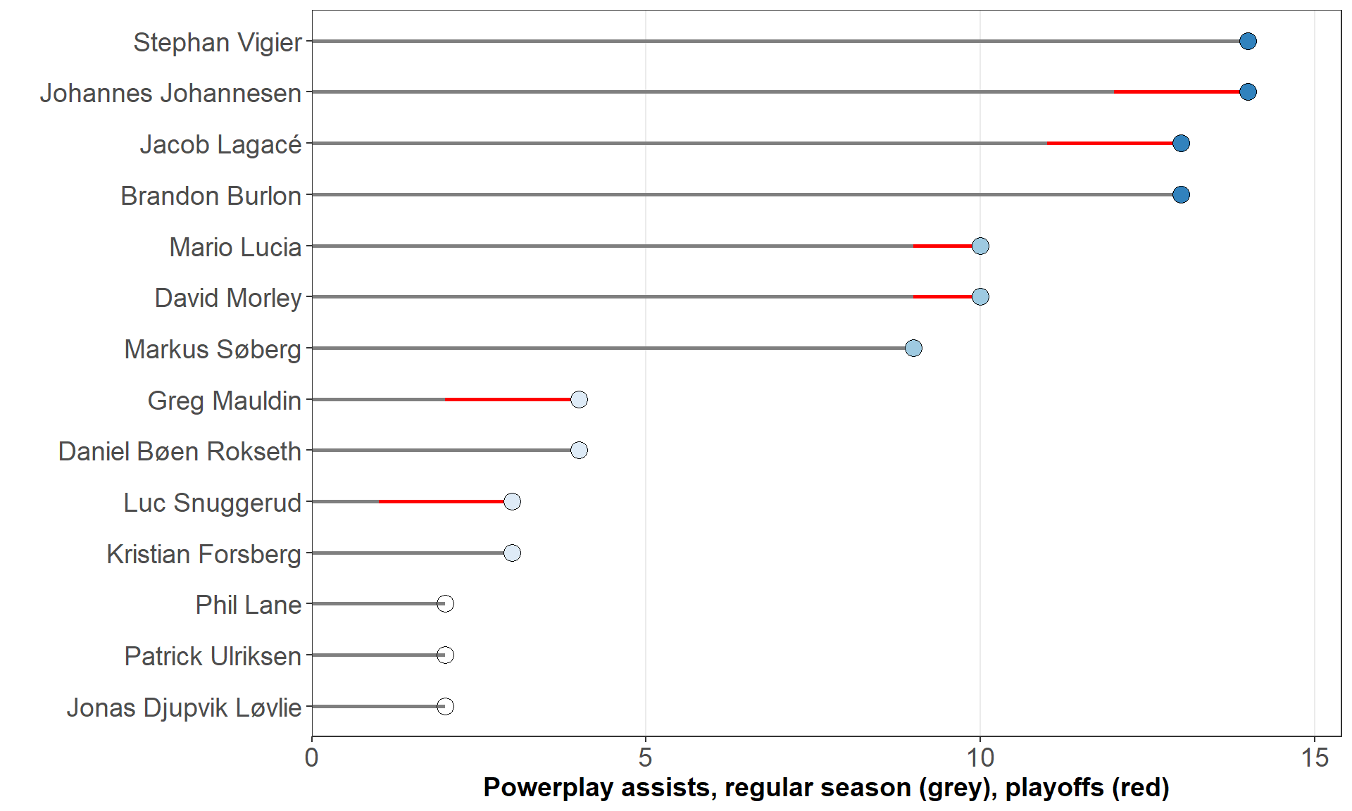
I wanted to visualize the personal statistics for the hockey players of Stavanger Oilers, for the 2018/2019 season.
The data material is scraped from both Elite Prospects and Hockey live (regular season and playoffs), using the R-package rvest, as described in this blog post.
The code
Scraping the data from Elite Prospects was straightforward, as it is stored as an HTML table. When you want to scrape a table with rvest, you only need to specify an index integer. Found by trial and error that the desired table was the second table of the web page, and removed some empty rows (which the web page uses for spacing):
library(rvest)
EP = read_html("https://www.eliteprospects.com/team/845/stavanger-oilers/2018-2019?tab=stats")
EPdat=EP%>%html_nodes("table")%>%.[[2]]%>%html_table()
EPstats = EPdat[!is.na(EPdat[,1]),]
However, the data tables at Hockey Live are populated with javascript, which prevents directly using the above method. I followed this tutorial, which suggests using PhantomJS to fetch the HTML page after the underlying javascript code has done its work. The rvest-method can then be applied to the resulting HTML page:
# assuming phantomjs.exe and season_scrape.js is placed in the working folder
system("./phantomjs season_scrape.js")
season_dat = read_html("data/season.html",encoding ="UTF-8")
season=season_dat%>%html_nodes("table")%>%.[[1]]%>%html_table()
# season_scrape.js
var webPage = require('webpage');
var page = webPage.create();
var fs = require('fs');
page.open('https://www.hockey.no/live/Statistics/Players?date=21.04.2019&tournamentid=381196&teamid=220882', function (status) {
fs.write('data/season.html',page.content,'w')
phantom.exit();
});Then, I combine the data from the two different sources, by merging the respective data frames. Unfortunately, the sources are not using identical player names, so some string handling is required to extract the last surname, which is then used as the merging column:
for(i in 1:nrow(season))
{
  tmp=strsplit(season$PLAYER[i], ",")[[1]]
  season$PLAYER[i]=tmp[1]
}

names=setNames(data.frame(matrix(ncol = 3, nrow = nrow(EPstats))), c("NAME", "POSITION", "PLAYER"))

for(j in 1:nrow(EPstats))
{
  tmp=strsplit(EPstats$Player[j], "\\s+")[[1]]
  names$NAME[j]=paste((tmp[-length(tmp)]),collapse = " ")
  names$POSITION[j]=tmp[length(tmp)]
  # Replaces special characters
  names$PLAYER[j]=chartr(paste(names(special_chars), collapse=''),paste(special_chars, collapse=''),tmp[length(tmp)-1])
}
season = merge(season,names)
To ensure the merging column is identical for each data source, accented characters in are replaced with their non-accented counterparts, using a method I found on stackoverflow.
Special characters
special_chars = list('S'='S', 's'='s', 'Z'='Z', 'z'='z', 'À'='A', 'Á'='A', 'Â'='A', 'Ã'='A', 'Ä'='A', 'Ç'='C', 'È'='E', 'É'='E',
'Ê'='E', 'Ë'='E', 'Ì'='I', 'Í'='I', 'Î'='I', 'Ï'='I', 'Ñ'='N', 'Ò'='O', 'Ó'='O', 'Ô'='O', 'Õ'='O', 'Ö'='O', 'Ù'='U',
'Ú'='U', 'Û'='U', 'Ü'='U', 'Ý'='Y', 'Þ'='B', 'ß'='Ss', 'à'='a', 'á'='a', 'â'='a', 'ã'='a', 'ä'='a', 'ç'='c',
'è'='e', 'é'='e', 'ê'='e', 'ë'='e', 'ì'='i', 'í'='i', 'î'='i', 'ï'='i', 'ð'='o', 'ñ'='n', 'ò'='o', 'ó'='o', 'ô'='o', 'õ'='o',
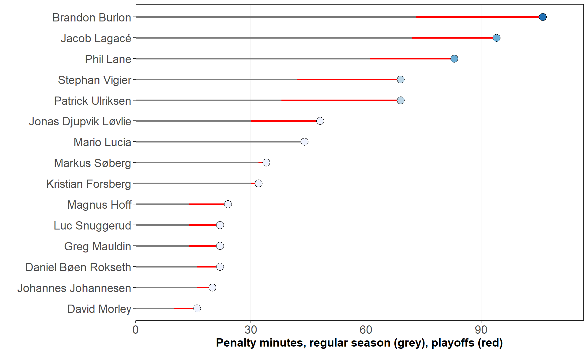
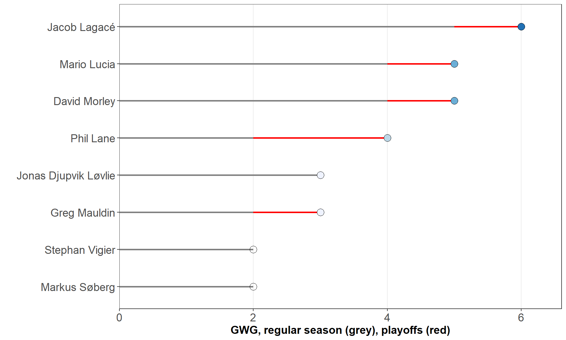
'ö'='o', 'ù'='u', 'ú'='u', 'û'='u', 'ý'='y', 'ý'='y', 'þ'='b', 'ÿ'='y' )The above code is for the regular season statistics, and the same method is also applied for the playoffs statistics. For some of the visualizations, I merge the regular season and playoffs data.
The figures are created with ggplot2, and the code are fairly similar for all figures.
Code used for generating the first figure
library(ggplot2)

season$col <- cut(
  season$PTS/season$GP,
  breaks=c(0, 0.25, 0.5, 0.75, 1, Inf)
)

ggplot(season[season$GP>10,],aes(x=PTS/GP,y=reorder(NAME,PTS/GP),fill=col))+
  geom_segment(aes(yend=NAME,x=G/GP,xend=0),colour="black",size=1.5)+
  geom_segment(aes(yend=NAME,x=PTS/GP,xend=G/GP),colour="grey50",size=1)+
  geom_point(size=4,shape=21)+theme_bw()+ylab("")+xlab("Total points per game (goals in black), regular season")+
  scale_x_continuous(expand = c(0, 0),limits = c(0,max(season$PTS/season$GP)*1.1),breaks=c(0, 0.25, 0.5, 0.75, 1))+
  theme(panel.grid.minor.x = element_blank(),panel.grid.major.y = element_blank(),
        legend.position = "none",axis.text=element_text(size=14),axis.title=element_text(size=14,face="bold"))+
  scale_fill_brewer("", palette = "Blues")
The results